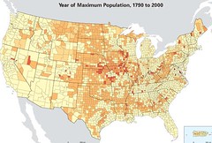
Our library just received its federal depository copy of the Census Atlas of the United States. It is just a wonderful piece of work. You can see it on the web but I respectfully suggest you find a library that has the hardcover. That way you can stick your nose down into the details.
I'll put up a few unofficlal screen captures for your enlightenment. See this one? It shows the (census) year of maximum population for each county in the United States. The brightest yellow means the highest number is 2000 - the county is bigger now than it has ever been. That's true of my home, for example.
But the darkest colors are reserved for counties that reached their pop peak BEFORE 1860. Wow.
Monday, April 14, 2008
Subscribe to:
Post Comments (Atom)


No comments:
Post a Comment